Monday, March 28, 2011

How much do you spend???

Its really a quite simple question isn't it? How much do you spend on photography? Think of all of the equipment bought, think of all of the hours and time spent, think of the creative exhaustion, think of all classes taken, blogs read, youtube watched. All of this... to make you a better photographer than the next person.

Next time you are shooting, time yourself on all aspects of the shoot: Pre-production, Production, and Post-production. I'll venture to guess that you spend around 1 to 2 hours on Pre production, 2 hours on production, and 2 - 4 hours on post-production. A conservative guess is that you are spending 5 hours on a shoot.

This next part some of you aren't going to like but it needs to be stated. How much are you charging? I look through the classifieds from time to time, and all I can say is WOW!! You are really going to charge $25 for a session and give them a CD of all of your images at the end. You are basically pricing yourself out of business. lets do the math.... $25 divided by 5 hours.... yup thats $5 an hour. At that rate you will never be able to find success in photography. You would do better to work in fast food for $7.50 an hour.

The worst part of this scenario is you are letting everyone (potential clients) know that photography is a cheap commodity, and that it shouldn't be taken seriously. Not only are you hurting your own business, your hurting everyone else's. People are starting to expect to pay less for photography. How much easier would it be to state your price knowing that people are expecting to pay a premium?

Now you may be saying, "I cant charge a lot, i am only learning right now" that may be true but look at the time your spending on a shoot and figure in all of your expenses. No matter what your charging, you need to come out in the positive. Also, you need to remember. WE ARE ALL LEARNING!!! have confidence in yourself and your abilities, no matter how limited. People will feel better about paying you more, if your confident.

I wrote this post because some of my students have a hard time in this area. They feel a cheap client is better than no client. Truthfully it can be hard to turn down clients because they don't want to pay. I promise this... if someone turns you down because your too much... you didn't want that client anyway, they would have been the worst client ever. Picky! Picky!

I would love to hear thoughts on this... please forward and comment.

Best

Jedediah


Tuesday, March 15, 2011

Marketing


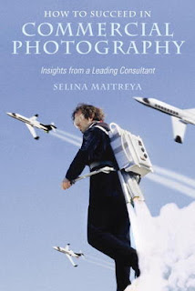
As of Lately I have been reviewing and editing the lectures for my advanced class. The class is created to help photographers with the business and marketing aspects of photography. I have been reading a couple of books on the subject and have made some very profound discoveries. The first book that I have been reading is a book by Selina Maitrea called "How to succeed in Commercial photography". Selina is a leading photography consultant that will work with all styles of photographers. Here technique on success starts with the photographers vision. This is the most important business quality that a photographer can develop. A photographers vision is what defines them in the market place. By developing a distinct vision the photographer will have a marketable product.
The next book I am reading is called "The Brand Gap" by Marty Neumeier. Neumeier Is a leading brand consultant and takes a more inside out approach to branding. He wrote "The Brand Gap" to help businesses get on the same page (so to speak) with the brand message that they are sending. His approach is more of collaboration of individuals giving input and working together to define a brand. This book has changed my view of branding all together. Most people think of brands as logotypes or design work to make something feel more professional... not at all! A brand lives inside of its customers. It is the gut feeling that people have about your service or product. ultimately we are not the ones defining our brand, our customers are!
I could get really carried away writing about this subject. If I did, I wouldn't have much to teach to my advanced students! Come take a class and learn how effective branding and marketing will really help your business. In the meantime I recommend purchasing and reading these two books.

Wednesday, March 2, 2011

Poor Little Bunny

A few days ago my wife sent an email to my sisters and my sisters in law. She tried to keep it secret, but she is horrible at keeping secrets... here is what it read:
I thought i Would share this funny little story for your enjoyment:
Friday morning I wake up, and go to the bathroom. I walk in to find the medicine basket down with the nyquill spilled all over the counter. Hmm, jed must not be feeling well. I come out of the bathroom, Jed rolls over and mumbles something to the effect of "I'm really sick", and back to sleep. So..., I assume he has the flu. It has been going around our house if you haven't heard. I proceed to change up my hair appointment I had that morning, and continue on with my day. I go in an hour later to check on my sick husband, see what I can do for him. He wakes up super grumpy, I ask about his symptoms, and all he can muster up is that once again he is really sick, and back to sleep. An hour after that, it is now around 10am, jed rolls out of bed and sits at the kitchen table and stares at me all nyquilled up. "How are you feeling?" "Do you think you have what Jessey had?" still trying to be nice and understanding. HIs response to me is "No, it's just my throat, it's all sore and scratchy and dry". Yes, it's true. Jed had a sore throat on Friday. Poor little Bunny. This is funny alone, but then my friend Ashley shared this video entitled "Man Cold" from youtube. Check it out.


Wednesday, February 23, 2011

A Student Request... Printing!

A student of mine asked If I could do a blog post about printing. I know all of us have sent off beautiful images to a printer only to have it come back looking... well... less than extraordinary. My students problem is this: He cant seem to get prints to look like the image did on his computer or even the back of his camera. They come back what seems to be darker than what he sees on his computer. I feel this is problem for most photographers. To get a good print is a constant struggle even for the best photographers.

There are quite a few different factors that contribute to a good print. I will now discuss in detail some of the main variables dealt with while printing.

1st exposure: your initial exposure needs to be dead on. A good exposure is key to a good print. by good exposure I mean, you should have highlight and shadow detail. We can tell a good exposure, generally, by checking the histogram on our camera. This will tell us if our highlights are over-exposed as well as our shadows being under-exposed. If we have a good exposure we can then move onto the next variable.

2nd Color balance: it is really important to have your image color balanced for a good print. Sometimes we over look this step. The problem is that if we have a serious color shift, our image is loosing information in one of the red, green, or blue channels of our photograph. Basically we are overexposing a color (usually red) and losing the detail information that it holds.

3rd Screen calibration: Chances are that you have never calibrated your computer monitor. This is probably the biggest obstacle to overcome. There are thousands of manufactures and millions of monitors in the world. As far as I know there is no standard they must follow to insure the color is correct on each monitor. This makes it very difficult because whats to say that your monitor and the printers monitor are going to be the exact same. If you can minimize this variable the better off you'll be. To do this you need to buy, borrow, or rent a color calibration device. Check with your local camera shop or printer to see if they rent them. Whoever you print with will most likely have their monitors calibrated. Once you have a calibrated monitor you can rely better upon the wysiwyg (what you see is what you get) principle. Even though you may be able to see details in both the highlights and shadows on the screen, it doesn't mean that it will print that way. your monitor is back-lit which makes it easier to see shadow detail. Prints rely on reflecrted light to see details, so its much harder to see the shadow details. Prints will generally add contrast to what you see in the monitor, you can plan for this. Still there are other variables that can't be ignored.

4th Printer chemistry: This is completely out of your control, but you can be prepared for it. Big print houses control this as carefully as possible. The variations between prints might not even be noticeable, but there is chance for error. If your working on a series of prints to be displayed together its best to have them all run at the same time. This helps eliminate the chance of chemistry changes that can cause variations between prints.

5th Paper: There are hundreds of different types of paper out there. Each one will have different results. Glossy paper will print contrast and clarity better than matte paper. Glossy will also print Shadow detail better than matte. know what your printing on and plan accordingly.

6th Image enhancements: This is probably the second biggest variable on destroying a good print. Often times we get a little carried away on trying to make an image look more interesting. We add contrast generally, this can block up shadows and blow out highlights, not helping the print. If you like the enhancement its better to be more subtle than to over do it, remember prints add contrast anyway.

Great... now what do I do?

There are a few things you can do with photoshop and without. This is assuming you are consistently using the same printer for your work.

Photoshop: you can actually soft proof your print on your screen (calibrated). You will need the .icc paper/printer profile to do this.
1. open the image
2. go to View-->proof setup--Custom...
3. In the proof setup dialog box click "device to Simulate" and select the .icc profile of your paper/printer.
4.Check both "simulate paper color" and "simulate black ink"
5. On Rending Intent change it to "perceptual"
6. OK

This will help us to see on the screen how its going to print. To be sure to get the best quality with your printer its best to do what is written next as well.

Not using photoshop: This is actually more complicated but it can help drastically. Send off a few different types of images to see how the printing affects them. Here are a few to try:
1. high key image
2. low key image
3. 3 of the same image with low, medium and strong contrast
4. A nice tonal black and white image
5. A contrasty black and white image
6. a portrait of someone with nice even color balanced lighting
7. A landscape.

Make sure that when you do this that you have good exposures on all, including details in both shadows and highlights. Be sure that the light in the images is color balanced as well. when you get the prints back compare them to the originals on the screen. Take notes of what changes are taking place. Are they all darker? Did the low key image lose detail easily? or is it just barely there? How about the high key? What about color? is there a color shift in all of the images?

By asking yourself these questions you can begin to see what needs to be done in order to get good prints. For prints that are dark... lighten them. For highlights that are lost... darken them. for too much contrast... flatten it out. For color shifts... add the compliment to balance it in printing.

I know this was a bit lengthy but I really hope that you glean some information from this and that it is useful to you...feel free to comment or add your own request. Happy shooting!


Tuesday, February 15, 2011

Retouching Anyone????


Here is a little known fact about me. I do love getting on the computer to retouch images. It is an integral part of my process. I love working with multiple images in order to create a more compelling image. My process is no secret and here is how I do it!!! Feel free to try it for yourself.
Items you will need:
Digital SLR camera
Tripod
lighting off camera (flash)
light shaping tools

1st Conceptualization: In any photograph or image, you need to conceptualize your work. Brainstorm your concept and subject matter. Decide how the subject matter is to be portrayed. Will a lot of contrast and hard light lend well with the subject? Would a softer light and less contrast be better? What are you trying to portray with your imagery? What do want your viewer to feel? Once you have a clear and concise Idea its time to move to production

2nd Pre-production: find a location that best suits your needs. remember it should enhance the photograph not hinder it. because your are making a digital composite image, it is not always necessary to have your subject and location together.
Find a subject that will make your photograph stronger than weaker. For example, if i'm shooting a car, I don't just grab the first Toyota Crap-olla I see. I research and find a car that i want to shoot. I then make all of the arrangements to shoot both the location and the car (Not necessarily in the same place at the same time, but it works better if you can).

3rd Production: While shooting both the location and the subject, I try to shoot them as individualized tiny photos, i do this using a tripod and light. I set the camera on the tripod and frame the shot. I don't focus on shooting the entire background or the entire car at once. Rather, I shoot one part at a time using light to highlight what I want to shoot. When I composite the images to make one, I sometimes have as many as 30 images. Once I have shot all I need for both the car and background I then take the images into the computer and start Post-production.

4th Post-Produciton: once I have the images in the computer the first thing I do is put on some headphones and listen to some type of electronica music. Right now I listen to the new TRON soundtrack... Great retouching music. I then load all of the photos into photoshop, creating a layer for each image. After this, I put a black layer mask on each layer. This hides all of the images except the bottom or base layer. I then use a white brush on the black layer mask to reveal the "highlighted or lit" part of the photo on that layer. After doing this to each layer it starts to reveal a beautifully lit subject and background.

I like this technique because i am able to create things with light that would be normally impossible with a regular film style shoot. I have the actual strobe in most of the shots I take, but since I am just "painting" in the lit part of the frame the light is not visible to the viewer. Pretty cool huh? Feel free to comment or contact me if you would like some more specifics on this process. It is a really fun thing to do!


Tuesday, February 8, 2011

About Me!


Jedediah Here!!


I have been a photographer for about 7 years now, and have worked in many different types of photography. I have done Everything from high fashion photography to automotive. One of my passions in life is to photograph old cars. Those of you that know me, know this about me, I love Cars. I love building cars and motorcycles. I have done this since I was a little boy. Growing up I would help my dad work on his 1936 ford Street rod. I enjoyed working with my hands and using tools.


So the question arises... How does an automotive mechanic get into photography? Funny you should ask. In order to answer this question correctly you need to know more about my family.


My mother is a very talented highly influential Ballet choreographer. She is well know throughout the world and has choreographed and preformed in places like China, Austria, Europe, and all over the United States. She is a highly creative individual with a vision that is unrivaled in here field. As a kid, I never really enjoyed going to the ballet. It was always a daunting task for my father to grab my brother and me to take us. Once I arrived, I would be easily mesmerized at the movement and beauty and the time seemed to fly. Once it was over I would go back to pretending that I didn't like it. My dear mother has influenced me greatly. I don't think she even knows. That is where i get my creativity and sense of composition. Because of her influence, I understand movement and how to make imagery move even though it may be a still photograph.


Now we all know that photography is a visual art form. and composition Is key to making a creative visually interesting photograph. But there is another side to photography that is equally as important. That is the technical side. What good is composition if you cant make a correct exposure. This is where my father's influence comes in.


My father is a machinist by trade, and a very brilliant man. I have seen him create, and problem solve my entire life. He can take any problem and find a solution that will not only fix the problem but enhance the performance in the solution. His work is also like art to me. It takes patience, and a careful hand to be a good machinist. It also takes a lot of knowledge and study to understand the different materials and reactions they might have while making a part. I worked with him for many years. I too learned this trade, I am so grateful for the lessons learned while working there. It is a profession that takes a lot of calculations and precision, in order to get a part that works properly.


As funny as it may seem... if you take these two professions and put them into a blender you would end up with photography. If you were to put these two people together you would end up with a child... me! Photography is the perfect blend of artistic and technical ability and that is why i have chosen it as my profession.


Tuesday, February 1, 2011

A night out


The Mrs and I were going through the usual motions on date night.
Annie: "what do you wanna do?"
Jed: "I don't know lets go eat somewhere"
A: "I"m not very hungry, besides I don't want to spend money on food" She never does, but I try anyway.
J: "lets go bowling or to a movie"
A: "I'm too tired, I'm not going to last" she has a hard time with late night activities, it can be difficult for me at times because I love the night.
J: "I want to be entertained" "lets do something"
A: "Isn't there an exhibit at BYU museum of art?"
J: "don't know lets check it out"
We drove to the museum and went in. Turns out that there is an exhibit of Carl Blochs works. I was really impressed with his paintings. He does some very interesting things compositionally, which I'll discuss later.
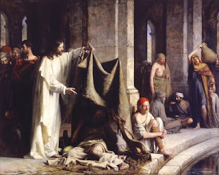
A little about Bloch... he lived in the 1800's and became a very well known religious painter from denmark. He is considered on of the master painters. He painted many depictions of christ, one of which is Christ healing the sick at bethesda. The Church of Jesus christ of latter day Saints (mormons) acquired this piece in 2001.
In this piece Christ is seen lifting a piece of cloth revealing a man who has come to bethesda to be healed. There are people surrounding him and there seems to be a lot going on in this tender moment. People in the background going about their day, while others are are trying to see what's happening. I found this piece to have a very interesting composition. Bloch decided to divide the frame directly down the middle. The pillar above the mans head is dividing the frame in half. Normally, when composing an image, we try and avoid such things. The reason being is that it causes the viewer to feel conflicted, not knowing as to which side to look. Bloch, however, paints Christ in white, meanwhile keeping the rest of the painting in more subdued tones. This brings our attention to him. Our eye will go to whatever is brightest in the frame. I think there is some symbology of this composition. Christ who is life or the "living water" is on one side while the supposedly "cleansing waters" of bethesda are on the other. Bloch not only divided the painting compositionally, he also divides it metaphorically.
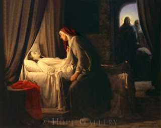
To see this piece as well as the others was really inspiring. It is a very large painting (life size). there were many great paintings on exhibit. My favorite painting on exhibit was The Daughter of Jarius. I found this painting to be quite different from the others. He turned the emphasis away from christ and directed it toward the grieving mother. As a matter of fact christ is painted in the shadows, as if he has just arrived. The piece is full of emotion, I didn't feel so far removed from the subject matter. It could happen to anyone, losing a child. I suppose this why I felt a connection to this piece... it seemed very real.
If you haven't been yet to the exhibit, please go! it was a great experience, and it was free! If you are someone who appreciates the aesthetics of art, I would recommend not doing the Ipad tour. I felt that I spent more time looking at the Ipad than looking at the art.